Web Performance Optimization: Improve Core Web Vitals
Introduction: Why Performance Matters
Web performance is not just a technical metric—it directly impacts user experience, conversion rates, and search engine rankings. A slow website frustrates users, increases bounce rates, and hurts your SEO. In today’s digital landscape, performance optimization is a critical responsibility for every web developer.
This guide covers practical ways to improve Core Web Vitals, from image optimization to caching and monitoring. If you are building with Astro, see our Astro tutorial for fast websites too.
Table of Contents
- Why Performance Matters
- Core Web Vitals
- Image Optimization
- Code Splitting & Lazy Loading
- Caching Strategies
- Minification & Compression
- Font Optimization
- Performance Monitoring Tools
- Best Practices Checklist
- Conclusion
Why Performance Matters
Website performance affects multiple aspects of your business:
- User Experience: Fast sites keep users engaged
- SEO Rankings: Google prioritizes fast websites in search results
- Conversion Rates: Studies show a 1-second delay reduces conversions by 7%
- Mobile Users: Performance is crucial for mobile device users
- Brand Reputation: Slow sites damage user trust
Core Web Vitals
Google uses Core Web Vitals to assess real-world user experience. Its three key metrics are LCP, INP, and CLS. Monitoring and improving them helps a website feel fast, responsive, and stable.
1. LCP (Largest Contentful Paint)
LCP measures when the largest visible element (text, image, or video) is painted to the screen. This metric is crucial because it indicates when users perceive that the main content has loaded, directly impacting perceived performance and user satisfaction.
Target: < 2.5 seconds
// Monitor LCP
new PerformanceObserver((entryList) => {
  const entries = entryList.getEntries();
  const lastEntry = entries[entries.length - 1];
  console.log('LCP:', lastEntry.renderTime || lastEntry.loadTime);
}).observe({ type: 'largest-contentful-paint', buffered: true });
How to improve LCP:
- Optimize server response times
- Remove render-blocking resources
- Optimize CSS and JavaScript
- Use CDN for faster content delivery
2. INP (Interaction to Next Paint)
INP measures how quickly a page provides visual feedback after a user interaction, such as a click, tap, or key press. Unlike FID, which only assessed the first interaction, INP considers interactions throughout the visit. A high value usually means JavaScript, rendering, or long tasks are blocking the main thread.
Target: ≤ 200ms at the 75th percentile
import { onINP } from 'web-vitals';

onINP(({ value }) => {
  console.log('INP:', value);
});
How to improve INP:
- Reduce JavaScript execution time
- Break up long tasks
- Use web workers for heavy computation
- Defer non-critical JavaScript
3. CLS (Cumulative Layout Shift)
CLS quantifies how much visible content shifts unexpectedly during page load. Layout shifts occur when elements move to accommodate newly loaded content (ads, images, iframes). High CLS values are frustrating for users and can lead to accidental clicks, making this metric essential for quality user experience.
Target: < 0.1
/* Prevent layout shift with fixed dimensions */
.image-container {
  width: 400px;
  height: 300px;
  aspect-ratio: 4/3;
}

img {
  width: 100%;
  height: auto;
}
How to improve CLS:
- Set explicit dimensions for images and videos
- Avoid inserting content above existing content
- Use transform animations instead of changing layout properties
Image Optimization
Images typically account for the largest portion of page weight—often 50% or more. Optimizing images is one of the highest-impact performance improvements you can make. This section covers modern image formats, responsive delivery strategies, and compression techniques that maintain visual quality while minimizing file size.
Modern Image Formats
Modern image formats such as WebP and AVIF generally offer better compression than traditional JPEG and PNG. Offer AVIF first, WebP as the modern fallback, and JPEG/PNG as the final fallback so browsers can choose the best supported format.
<picture>
  <source srcset="image.avif" type="image/avif">
  <source srcset="image.webp" type="image/webp">
  <img src="image.jpg" alt="Description">
</picture>
Responsive Images
<!-- Serve different sizes for different devices -->
<img
  srcset="
    small.jpg 480w,
    medium.jpg 800w,
    large.jpg 1200w,
    xlarge.jpg 1600w
  "
  src="medium.jpg"
  sizes="(max-width: 600px) 100vw,
         (max-width: 1000px) 80vw,
         1000px"
  alt="Responsive image description"
>
Lazy Loading
Lazy loading defers off-screen images until the user approaches them. This reduces initial load time and bandwidth use, especially on long pages. Use it only for images outside the initial viewport; hero and LCP images should load normally so they do not delay the main content.
<!-- Native lazy loading -->
<img src="image.jpg" loading="lazy" alt="Description">
Always provide width and height (or an aspect-ratio) so the browser can reserve space before an image loads and avoid increasing CLS.
Image Compression Tools
You can compress images through a self-hosted pipeline, a cloud-based service, or a desktop application. The right choice depends on asset volume, dynamic-transformation needs, cost, and image-privacy requirements. Local or CI/CD pipelines give you full control and reproducible output, while cloud-based services simplify automated optimization and delivery.
Self-Hosted Options
ImageMagick
ImageMagick is a flexible choice for resizing, stripping metadata, and converting formats. This command caps the image width at 1600px, fixes EXIF orientation, removes metadata, and writes a smaller JPEG:
magick input.jpg -auto-orient -resize '1600x1600>' -strip -interlace Plane -quality 82 output.jpgCreate a WebP version with a quality setting tailored to the image type:
magick input.jpg -auto-orient -resize '1600x1600>' -strip -quality 78 output.webpRun magick against copies or an output directory rather than overwriting originals. Review photographs, illustrations, and images containing text visually, since their best quality settings can differ.
Other Local Pipeline Options
- Sharp (Node.js/libvips): fast for Node.js build pipelines and generating responsive variants. Use
jpeg({ quality: 82, mozjpeg: true }),webp({ quality: 78 }), oravif({ quality: 50 })for the target format. - libvips (
vipsthumbnail): a lightweight, fast CLI for thumbnails and large batches of responsive sizes. - cwebp and avifenc: dedicated encoders from the WebP and libavif projects, useful when you need direct control over modern-format encoding.
- mozjpeg, pngquant, and oxipng: JPEG- and PNG-focused optimizers.
pngquantis lossy, whileoxipngpreserves pixel data. - SVGO: safely cleans SVGs in a local pipeline, for example
npx svgo -f src/assets/icons.
A simple ImageMagick batch command for a separate output directory looks like this:
mkdir -p public/images/optimized
magick mogrify -path public/images/optimized -format jpg -auto-orient -resize '1600x1600>' -strip -interlace Plane -quality 82 public/images/source/*.{jpg,jpeg}
For production, make this a build script or CI job, keep generated files separate from source assets, and measure file sizes before and after optimization. Continue serving responsive sizes and WebP/AVIF: compression alone does not replace a sound image-delivery strategy.
Cloud-Based and Desktop Options
- TinyPNG/TinyJPG: convenient for manual or API-based PNG/JPEG compression, particularly for small to medium volumes.
- Cloudinary and similar image CDNs: resize, reformat, and adjust quality while serving images; useful when you need dynamic transformations.
- Squoosh: useful for comparing visual quality and file size manually before choosing pipeline settings.
- ImageOptim: a macOS desktop application for manual asset optimization.
Choose a self-hosted option when assets must remain within your infrastructure or the build output must be fully reproducible. A cloud-based option is convenient for on-demand transformations and CDN delivery, but account for cost, asset privacy, and service dependency.
Code Splitting & Lazy Loading
Code splitting breaks your JavaScript bundle into smaller chunks that load on-demand rather than sending everything upfront. This dramatically reduces initial load time, especially for single-page applications with many features. Combined with route-based splitting and dynamic imports, you can achieve near-instant page loads.
Dynamic Imports
Dynamic imports allow you to load JavaScript modules on-demand using the import() function. This is perfect for components that aren’t needed immediately, such as modals, settings panels, or advanced features that only some users will access.
const HeavyComponent = lazy(() => import(’./HeavyComponent’));
function App() {
return (
<Suspense fallback={
### Route-Based Code Splitting

Route-based code splitting separates a bundle by route, so users download only the JavaScript needed for the current page. It is especially effective for applications with many pages or features.

```javascript
// Next.js example
import dynamic from 'next/dynamic';

const DynamicPage = dynamic(() => import('../pages/expensive-page'), {
  loading: () => <p>Loading...</p>
});

export default function App() {
  return <DynamicPage />;
}
Bundle Analysis
Understanding what’s in your bundle is crucial for optimization. Bundle analysis tools visualize your code to identify large dependencies, duplicated modules, and opportunities for splitting. Regular analysis helps catch performance regressions early in development.
# Analyze bundle size
npm install --save-dev webpack-bundle-analyzer

# Check bundle composition
webpack-bundle-analyzer dist/stats.json
Caching Strategies
Caching stores static and semi-static content closer to users, reducing server load and improving response times for repeat visitors. Strategic cache headers tell browsers and CDNs how long to cache content, providing the best balance between freshness and performance.
Browser Caching
Browser caching stores resources locally on users’ machines, eliminating the need to re-download them on subsequent visits. Set appropriate cache headers in your HTTP responses to control caching behavior and maximize performance gains for returning visitors.
Cache-Control: public, max-age=31536000Cache duration guidelines:
- HTML: 0 seconds (no-cache)
- CSS/JS: 1 year (with content hash)
- Images: 1 year
- Fonts: 1 year
- API responses: varies by content
Service Workers
// Basic service worker for offline support
self.addEventListener('install', event => {
  event.waitUntil(
    caches.open('v1').then(cache => {
      return cache.addAll([
        '/',
        '/index.html',
        '/styles.css',
        '/app.js'
      ]);
    })
  );
});

self.addEventListener('fetch', event => {
  event.respondWith(
    caches.match(event.request).then(response => {
      return response || fetch(event.request);
    })
  );
});
CDN Distribution
Use a Content Delivery Network (CDN) to serve static assets from servers closer to users:
- Cloudflare
- AWS CloudFront
- Akamai
- Fastly
Minification & Compression
JavaScript & CSS Minification
// Development
const bundle = 'console.log("Hello, world!"); const x = 42;';

// Production (minified)
const bundle = 'console.log("Hello, world!");const x=42;';
Compression Algorithms
# Enable gzip compression in nginx
gzip on;
gzip_types text/plain text/css application/json application/javascript;
gzip_min_length 1024;
gzip_compression_level 6;
Tree Shaking
Remove unused code during bundling:
// unused.js
export function used() { return 'used'; }
export function unused() { return 'unused'; }

// app.js
import { used } from './unused';
console.log(used()); // unused() will be tree-shaken
Font Optimization
Fonts can significantly impact performance if not optimized.
Font Loading Strategy
/* Preload critical fonts */
@import url('https://fonts.googleapis.com/css2?family=Roboto:wght@400;700&display=swap');

/* Font-display strategies */
@font-face {
  font-family: 'MyFont';
  src: url('font.woff2') format('woff2');
  font-display: swap; /* Show fallback immediately */
}
Web Font Best Practices
- Limit font families (2-3 maximum)
- Load only needed font weights
- Use variable fonts to reduce file size
- Subset fonts to remove unused characters
Performance Monitoring Tools
Google Lighthouse
Built into Chrome DevTools, provides audits for performance, accessibility, and SEO.
# CLI usage
npm install -g lighthouse
lighthouse https://example.com --view
PageSpeed Insights
Analyzes pages and provides optimization suggestions: https://pagespeed.web.dev
WebPageTest
Detailed performance testing from multiple locations: https://www.webpagetest.org
Real User Monitoring (RUM)
// Collect metrics from real users
import('web-vitals').then(({ onCLS, onINP, onLCP }) => {
  onCLS(console.log);
  onINP(console.log);
  onLCP(console.log);
});
Best Practices Checklist
Performance optimization checklist for every project:
- ✅ Measure and monitor Core Web Vitals
- ✅ Optimize INP rather than FID
- ✅ Optimize and serve modern image formats
- ✅ Implement code splitting for large bundles
- ✅ Configure browser and server caching
- ✅ Enable gzip/brotli compression
- ✅ Minify CSS and JavaScript
- ✅ Defer non-critical JavaScript
- ✅ Use a CDN for static assets
- ✅ Optimize fonts and font loading
- ✅ Remove render-blocking resources
- ✅ Test performance with Lighthouse
- ✅ Set up performance monitoring
Conclusion
Web performance optimization is an ongoing process. Start with images and LCP, measure INP and CLS with real-user data, then fix the bottlenecks with the greatest impact. For offline caching implementation, continue with our PWA, service worker, and caching strategy guide.
Remember: performance is a feature, not an afterthought. Prioritize it from the start of your project, and your users will thank you with better engagement and conversions.
Related Articles
Keep reading within the same topic.
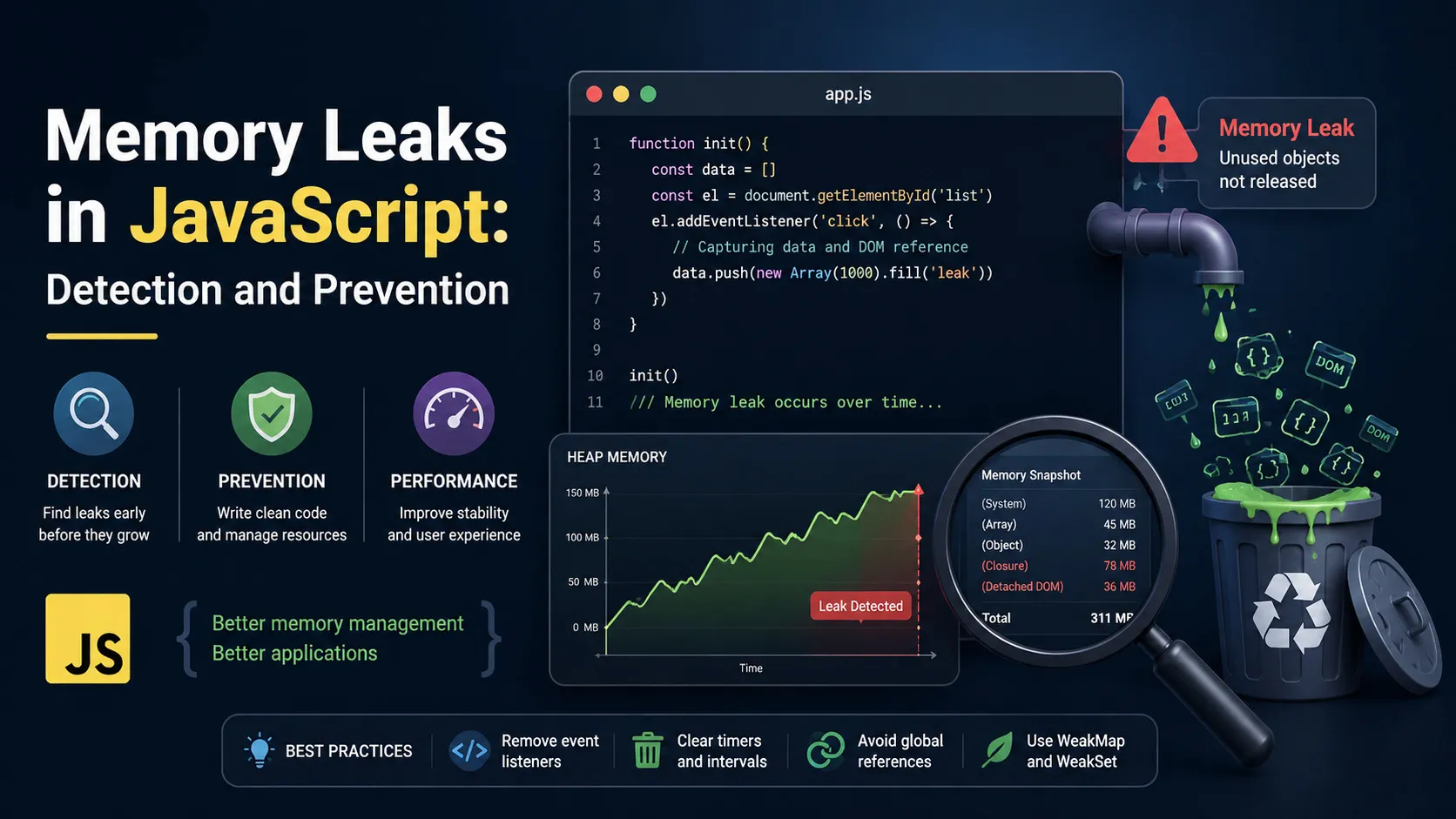
JavaScript Memory Leaks: Detect and Fix with Chrome DevTools
Find and fix JavaScript memory leaks with Chrome DevTools, heap snapshots, listener cleanup, timers, closures, and prevention patterns.

Flask Logging Guide: Levels, Formats, and Sentry
Set up Flask logging with useful levels, structured formats, handlers, Rich output, and Sentry integration for easier debugging.

Web App Testing Strategy: Unit, Integration, and E2E
Plan a web app testing strategy across unit, integration, and E2E tests with practical coverage decisions and tooling tradeoffs.

Web Security Basics: OWASP, Auth, and Common Attacks
Understand web security basics with OWASP risks, authentication, authorization, XSS, CSRF, SQL injection, and safer app practices.